UPDATE – Since this article posted on May 5, the Utah Department of Health has upgraded and updated the amount and quality of Covid-19 data. Many thanks to Angela Dunn and the State of Utah for providing these much needed resources so we can make better decisions about running our businesses and making safe choices with regard to our families and loved ones. The Coronavirus data dashboard can be found here: https://coronavirus-dashboard.utah.gov/
by Spencer Hoole
I am certainly nowhere close to being a health expert, nor am I doctor. As such, don’t trust or rely on anything I say, including my random musings below. However, I do own an HP12C financial calculator, circa 1986, and understand math and the basic differences between what is possible and what is probable. I also have a deep appreciation for numbers and statistics. When I was in college, I was watching an NFL game and the commentator said something that struck me and has stayed with me since. When referencing one of the team’s impressive individual stats compared to their abysmal win total, he said, quoting a phrase Mark Twain popularized, “There are lies, damned lies, and statistics.” His point is that stats can be very misleading, so always do a deeper dive into what is producing actual outcomes.
Beginning on April 2, I started writing down Utah’s Coronavirus numbers in my notebook, specifically Cases, Tested, Hospitalizations, and Deaths. My sample size is one month’s worth of data from a much-beloved flyover state. [Source: coronavirus.utah.gov]
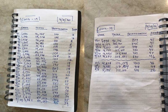
You might be asking, why did he write this information down when it’s easily accessible on Utah’s Coronavirus dashboard? Good question, one it made me feel like I was doing something, which in reality was nothing; and two, it allowed me to compare daily numbers with actual percentage changes. After studying and pouring over Utah’s numbers (probably way more than I should) admittedly I am perplexed. Damned statistics. Why? Because I now have far more questions than answers.
Early on, I noticed a simple pattern about the percentage of confirmed cases relative to the numbers of people tested. The percentage of confirmed cases remained relatively consistent for 30 straight days between 5.1% and 4.3%, regardless of the total number of individuals tested. The more people we tested, the more cases we had. However, the percentages of confirmed cases were still within one percent. It didn’t matter if we tested 1k or 5k+ in a single day, the percentages remained relatively the same.
This simple consistent, and at times slightly declining, percentage of infections seemed to be lost on some in our local media, and a couple of mayors, who are squarely focused on the number of confirmed cases. Their overriding concern is, “Cases are going up, there is a problem,” without properly acknowledging that so were the number of test results. Given this data and mindset, if we really want to bring our confirmed cases down, shouldn’t we just do less testing? Given the consistent percentages, we could cut our confirmed numbers in half if we also reduced testing by the same. [Utah has some of the highest testing data per capita in the nation, thanks in part to TestUtah.com]
To illustrate, we have significantly more cases [4,981 as of 5/2] than our good neighbors to the north, Idaho [2,061]. However, look at our testing totals [117,804] versus theirs [29,335]. One day last week, Idaho showed a very low 14 new confirmed cases, while in Utah the number was much higher at 155. Should we conclude that Idaho is doing a better job than Utah with flattening the curve? Perhaps, then again, look at the number of tests done each day and compare percentages. As a side note, Idaho whose population is smaller and has less confirmed cases, has 64 deaths compared to Utah’s 49.
Here are the key metrics from Utah that did not fluctuate much throughout April:
April Utah Coronavirus Numbers
- Confirmed Cases as a function of Tests – 5.1% on 4/2 and 4.3% on 4/30
- – Note testing requirements liberalized in UT throughout the month
- Total Hospitalizations per Confirmed Cases – 9.3% on 4/2 and 8.4% on 4/30
- – Average new hospitalizations per day: 9.6
- Deaths per Confirmed Cases – 0.65% on 4/2 and 0.98% on 4/30
- – Average deaths per day: 1.2
Given that the percentage of confirmed cases to those tested is approximately 5%, regardless of how many people are tested on a given day, can we conclude that approximately 5% of all Utahns have had Coronavirus, or roughly 150,000 residents? Could it be this simple of an extrapolation of the 30 test groups used in April, something akin to how a political pollster would size up an election? Or is this being overly simplistic? Damned statistics.
The chief criticism of estimating the total number of cases using the percentage of current infected data sets is that it is subject to “adverse selection.” Meaning, those who are being tested are generally either sick (they have one of the six COVID-19 symptoms outlined by the UDOH), or they came into direct contact with someone who was positive and decided they also needed to be tested. Therefore, the people being tested are disproportionately already skewed to infection, so a 5% total estimate of the entire state’s population is high.
Adverse selection is worth considering when projecting estimated cases based on actual testing numbers. However, think about all the infected individuals who have not been tested for whatever reasons. For example, those who are asymptomatic, have mild symptoms, couldn’t get tested (early days of outbreak) or lack the information or time needed to get tested. There have been plenty of people who believe they might have had COVID-19 but didn’t want to go through the process of being tested. Instead, they decided to power through it. Point being, there are a lot of positive cases that are not being counted. It’s hard to know the total estimate of cases without doing random testing. However, doing 1k to 5k+ tests a day for 30 straight days does give us a pretty good indication of infection rates.
Does anyone really believe the total number of Coronavirus cases in Utah as of 5/3 is 5,175? We had our largest day’s increase today with 194, yet the percentage of infections to those tested remains around 4.2%. If we had randomly tested 100k residents today, would our daily increase have been closer to 5k? Imagine what the media and certain politicians would be saying if our numbers spiked by 5k in a single day, “we need a complete and total lockdown.” If the denominator, i.e., cases, goes up sharply but the number of hospitalizations and deaths per day remain consistently low, isn’t that good news?
Based on the data we have from the state, the denominator for the hospitalization and mortality rates is much, much larger than 5,175 confirmed cases. In fact, it’s probably around at least 5% of the state’s total population of 3.1M or 155k estimated cases. [We’re not even including an estimate for those who may have antibodies and/or were previously infected.] If this is a more accurate figure, then the hospitalization rate is closer to 0.28%, not 8.5%, and the mortality rate drops from 0.98% to 0.03%. Which is getting down closer to the flu range of .01%. With these dramatically lower percentages for hospitalization and negative outcomes, most citizens will be much more inclined to resume a more normal routine. That is, of course, contingent upon understanding health probabilities and facts versus possibilities.
With these simple observations, here are a few questions for our elected officials and the Department of Health.
Isn’t it time to do more random testing for Coronavirus to get a truer picture of the number of cases? Some healthcare officials have stated that would just give us more false positives. If that is the case, wouldn’t that be the same issue with the testing we are doing right now?
Isn’t it time to have a more detailed and robust Coronavirus dashboard in Utah showing the following information?
- Confirmed Cases next to Estimated Total Cases
- Hospitalizations next to Total Patients Discharged
- Average and Median Hospital Stay
- Percentage of Patients Admitted to ICU
- Total Deaths next to Estimated Mortality Rate based on Estimated Cases
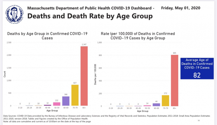
- Deaths and Death Rate by Age Group [See Massachusetts’ COVID-19 Dashboard below]
- Average and Median Age of Death
- Detailed information on comorbidities and underlying health risks
Isn’t it time to do a better job of protecting those who are most at risk for COVID-19? If the majority of people dying in Utah are elderly and in rest homes, shouldn’t we being doing much more as a state to protect them? Why are we not regularly testing all the workers at long-term care facilities and nursing homes? Let’s put resources and efforts where they are needed most, with the elderly and our higher risk populations.
Isn’t it time to start framing policy decisions in terms of what is probable and not what is possible?
Isn’t it time to get a much better understanding of the denominator, so we can stop obsessing over fluctuations in daily case counts? One respected doctor posted on Twitter that Utah’s numbers are smoldering after looking at yesterday’s case numbers. Again, no acknowledgement of the number of tests performed and the fact the actual percentage of confirmed infections dropped from 4.3 to 4.2%.
Armed with more robust and richer data, with a clearer understanding of probabilities, we can all make better personal health and risk decisions.
“Without data, you’re just another person with an opinion”
W. Edwards Deming
Spencer Hoole is the CEO of Salt Lake City-based Diversified Insurance Group
See another post by Spence HERE